Why we Moved our Website from Webflow to Framer
Tools either help you move faster – or get in the way
So, we were in the middle of shipping a new site.
I’m trying to tweak the layout, David is tweaking the content, and Ben is trying to add a new new page.
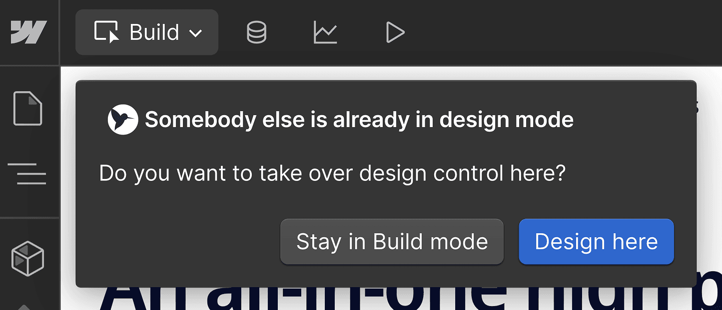
Then Webflow kicked me out.
Why? Because we were trying to edit the site at the same time.
That was the moment we realised: this tool was slowing us down.
At Superthread, we’re a small team of three. We move fast. We iterate constantly. But Webflow’s single-user editing model became a silent tax on speed.
We’d used Webflow for two years. It had served us well, but it was now obvious it was reducing our velocity. So we’ve bit the bullet and moved our entire marketing site from Webflow to Framer.
Why we switched
This wasn’t just a redesign. It was a full rebuild. And it came with some wins – and some real tradeoffs.
Our goals were pretty simple:
- Make the site feel more modern and polished
- Move faster as a team
- Collaborate in real-time without stepping on each other
- Avoid engineering bottlenecks for simple design tweaks
Webflow’s biggest flaw for us was single-user editing. One person at a time. No exceptions. In 2025, that feels broken – especially when we collaborate in real-time in Figma, Slack, Google Docs… even Superthread itself.

Real-time collaboration matters
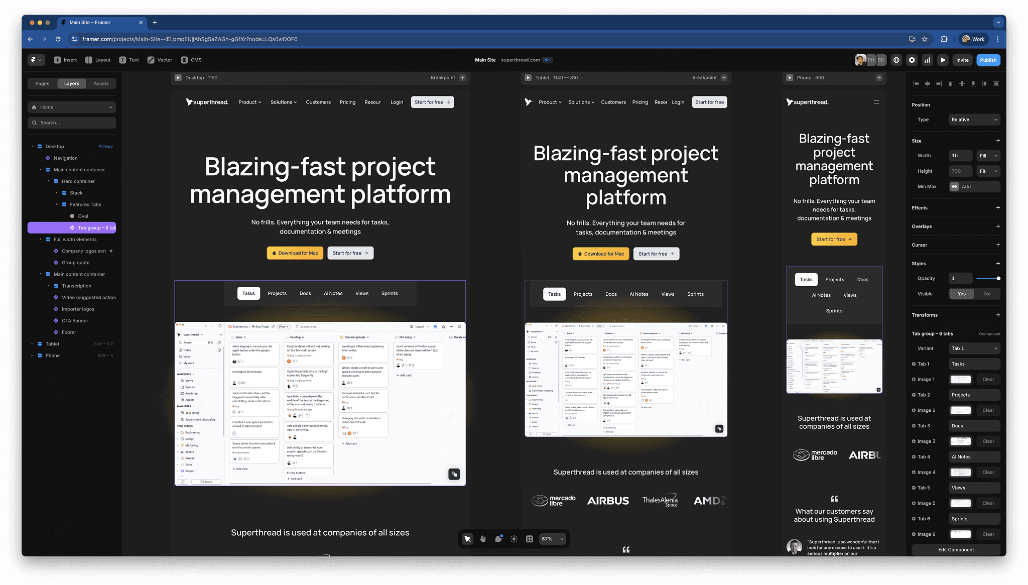
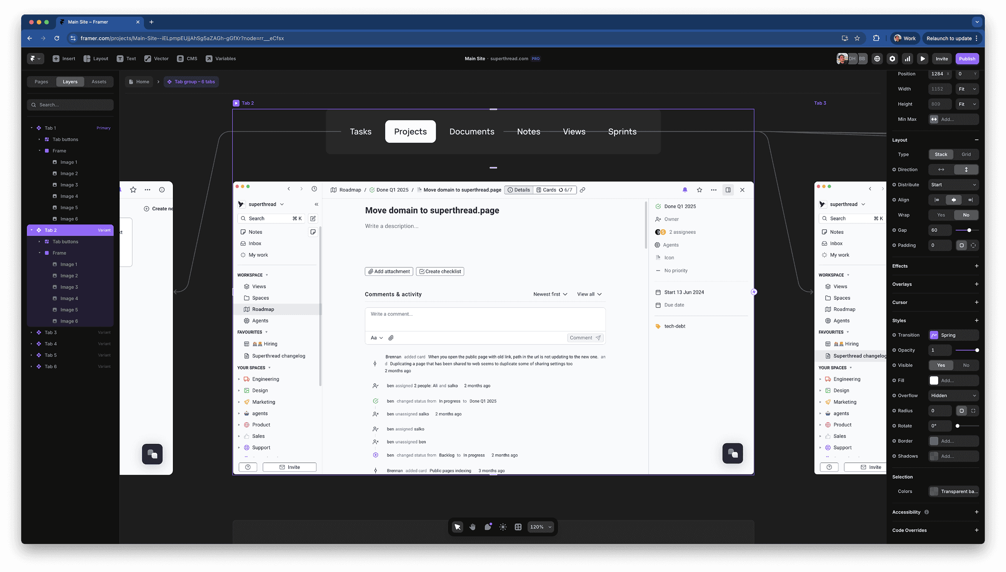
When we first opened Framer, the experience felt instantly familiar – like Figma, but with a publishing button (that said Figma now has site building feature in beta).
We were editing different pages at once, seeing each other’s cursors, leaving comments, and building components together. Just like that, our bottlenecks disappeared.
It wasn’t just faster – it was more fun.
Framer feels purpose-built for small product teams who want to move fast without writing a ton of code. The component system is clean and intuitive. Adding basic animations, fades, transitions, hovers is almost magical. You design the states you want, hit Publish, and Framer turns them into real, performant front-end code. It’s surprisingly empowering.
Where Framer falls short (and some workarounds)
To be clear, the move wasn’t frictionless. Framer came up short for us in a few small ways, but we’ve been able to work around most of them.
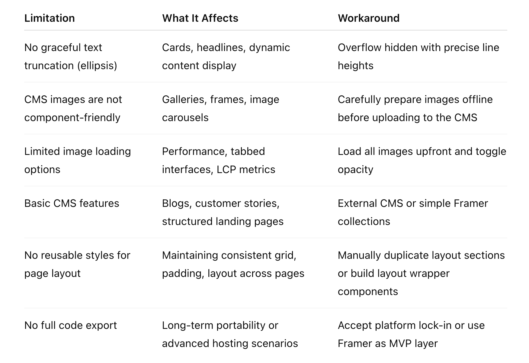
1. Image loading optimisation
We care a lot about performance. With Webflow, we could control lazy loading, preloading, compression, image formats – the whole deal.
In Framer, we hit a problem with tabbed screenshots: when you clicked a tab, the image would load on demand, causing a jarring flicker. In Webflow, we could set these images to preload so they’d appear instantly when a user clicked between tabs.
Our hacky workaround: load all images upfront and toggle their opacity when a user clicks into a new tab. It worked – but it’s not elegant. This is both a testament to how easy it is to configure interactive components, but also frustrating that a workaround was needed in the first place.
It’d be great if Framer had built-in options to manage preload strategies or smarter lazy-loading behaviour.
2. CMS design
Webflow’s CMS, while not perfect, is fairly powerful. It supports reference fields, dynamic filtering, multi-reference relationships, and more. Framer’s CMS is still quite basic by comparison. For our current needs, it’s fine. But if we were running a more content-heavy site with dozens of blog posts or SEO landing pages with structured data, we’d probably hit some limitations. Considering Framer emphases its design prowess, its disappointing that you cannot create components to customise the way images are displayed, or create galleries within the CMS.
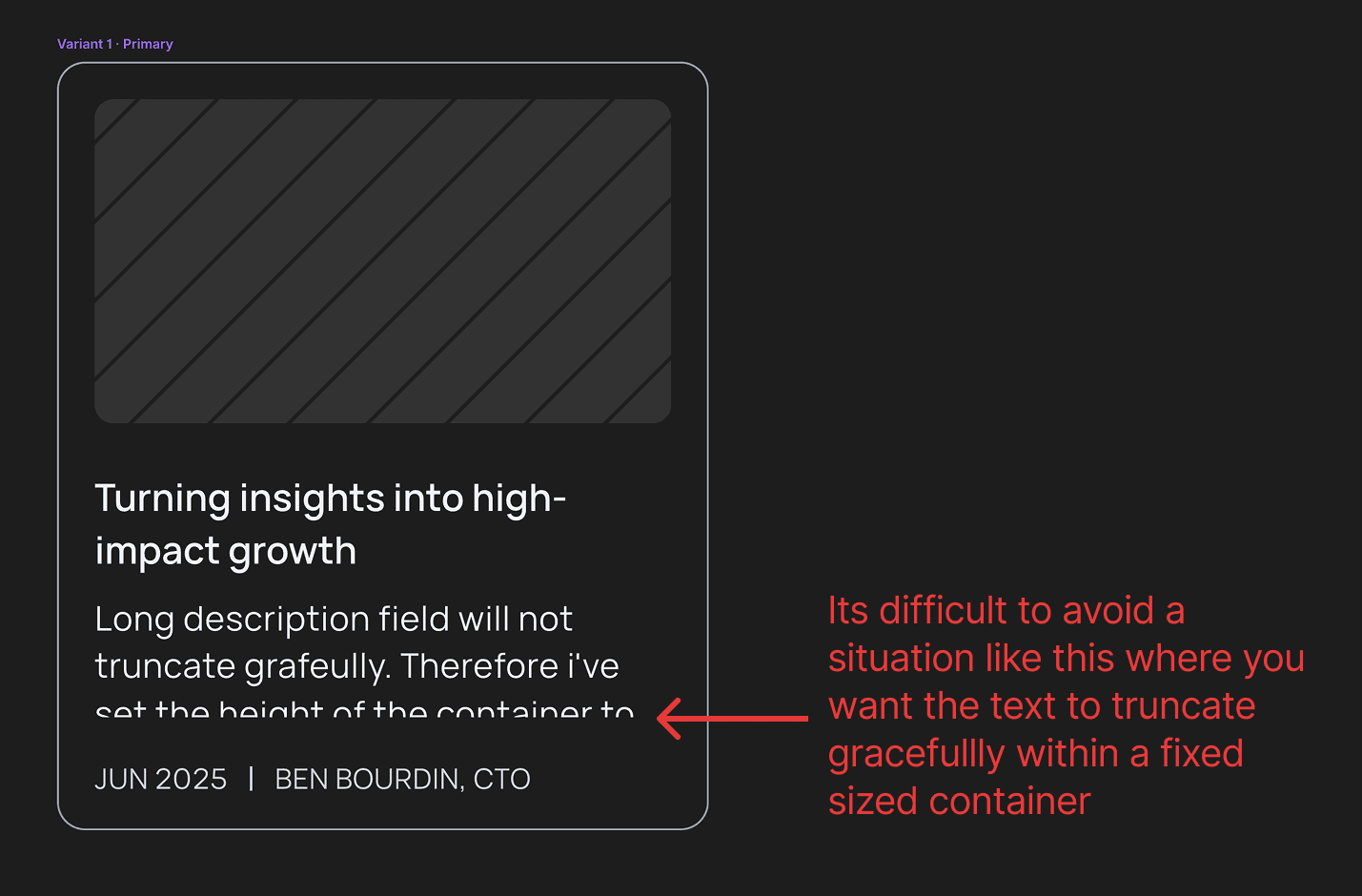
3. Text truncation (or lack thereof)
This one’s silly, but painful.
You can’t truncate text properly in Framer. No text-overflow: ellipsis. No line clamping. Nothing.
So if you’re building a blog index or a grid of cards, you’ll either:
a) cut the text off mid-word b) end up with uneven layout heights c) scream
Our workaround? Set container heights to an exact multiple of line-height so at least it doesn’t chop the text horizontally. Not ideal.
We could write custom CSS where we absolutely need truncation, but that defeats the whole low-code goal of the platform.
4. No way to re-use layout styles
This one hurts the most.
In Webflow, you can create a layout class (say, section-spacing) and reuse it across every page. Update it once, and every instance updates.
In Framer, there’s no way to define global layout styles. Want to change the vertical spacing between sections across 30+ pages? You’re doing it by hand. Double that if you want different spacing on mobile.
This is a big reason why small layout tweaks feel heavy in Framer.
I don’t know an obvious workaround – please let me know if you find one! Webflow is much further ahead here, especially as it allows you to create compound styles by stacking multiple classes on the same element.
Summary of tradeoffs we’ve experienced
Heres a quick summary:
Why we’re still glad we switched
Despite those limitations, the move to Framer has been a net positive.
- We can move faster as a team – no more design session lockouts.
- The design experience is better – font styles and breakpoints are super easy to work with, and the interface is fast and snappy.
- We enjoy using Framer – its fast, intuitively laid out and rarely gets in your way.
- We’ve added animations and interactive polish to our site without needing engineers.
- The component system helps keep our design consistent across new landing pages.
- The community copy/paste remix system is a delightfully simple way to experiment with new ideas.
- The recently added support for vector assets and creation is extremely welcome.
- It’s just plain easier to collaborate in real time.
Framer might not be the right tool for every team, especially if you need deep CMS functionality or full control over performance optimisations. But for a small team that needs to move quickly and work together without friction, it’s a game-changer.
Final thoughts
We’re not blind to Framer’s limitations and I’m sure we’ll discover more. No tool is perfect. Webflow gave us power – but slowed us down. Framer gives us speed – but hides a lot under the hood.
We chose velocity.
It’s the right trade-off for our team right now.